Fraktur
Johann Heinrich Otto
ca. 1770–1800 · Watercolor, pen and iron gall ink, and graphite on off-white laid paper · The American Wing
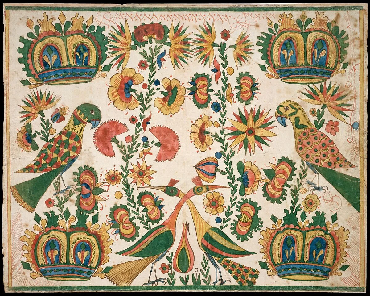
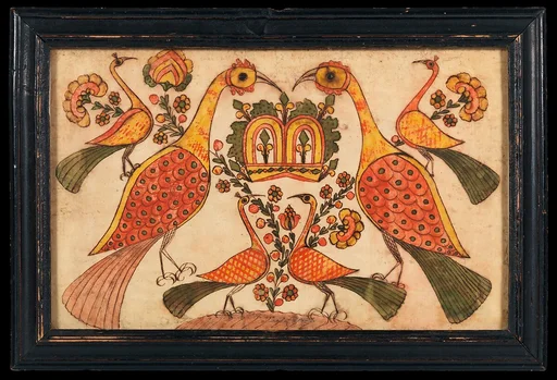
By 1770, Otto, a German émigré, had begun to make various forms of fraktur, a style of decorative calligraphy named after a sixteenth-century German typeface. Otto’s skill is evident in the pleasing checks and balances of color and form he achieved in the composition of repetitive motifs. For example, the parrots perched at either side of the sheet and the two peacocks that cross necks above the tulip are nearly identical in form but vary in the patterning on their wings. Touches of blue enhance the harmony among the reds, greens, and yellows that dominate in Pennsylvania German fraktur designs.
- Artist
- Johann Heinrich Otto
- Date
- ca. 1770–1800
- Medium
- Watercolor, pen and iron gall ink, and graphite on off-white laid paper
- Culture
- American
- Department
- The American Wing
- Credit line
- Gift of Edgar William and Bernice Chrysler Garbisch, 1966